Insights
Warranty Data-Driven After-Sales Upgrade: Data Statistics
2026-09-21 10:20:45
Service centers must simultaneously track four interlocking metrics every day — intake, output, WIP, and average TAT — that are all tightly interconnected: if intake volume consistently exceeds output volume, WIP will inevitably pile up quickly, which in turn drags down TAT. Yet most service centers still rely on weekly or monthly reports to catch anomalies, and by the time the data is compiled, the problem has often already been building for weeks, with the interplay between anomalies frequently getting pulled apart and viewed in isolation. What makes this even trickier is that the "normal range" for these metrics itself shifts over time — the same number can mean something different depending on the stage. Understanding when a number should be treated as abnormal requires first grasping a more fundamental fact: product failures are simply not evenly distributed across the usage timeline.
I. Failure Theory Basis: The Bathtub Curve and the Hazard Function
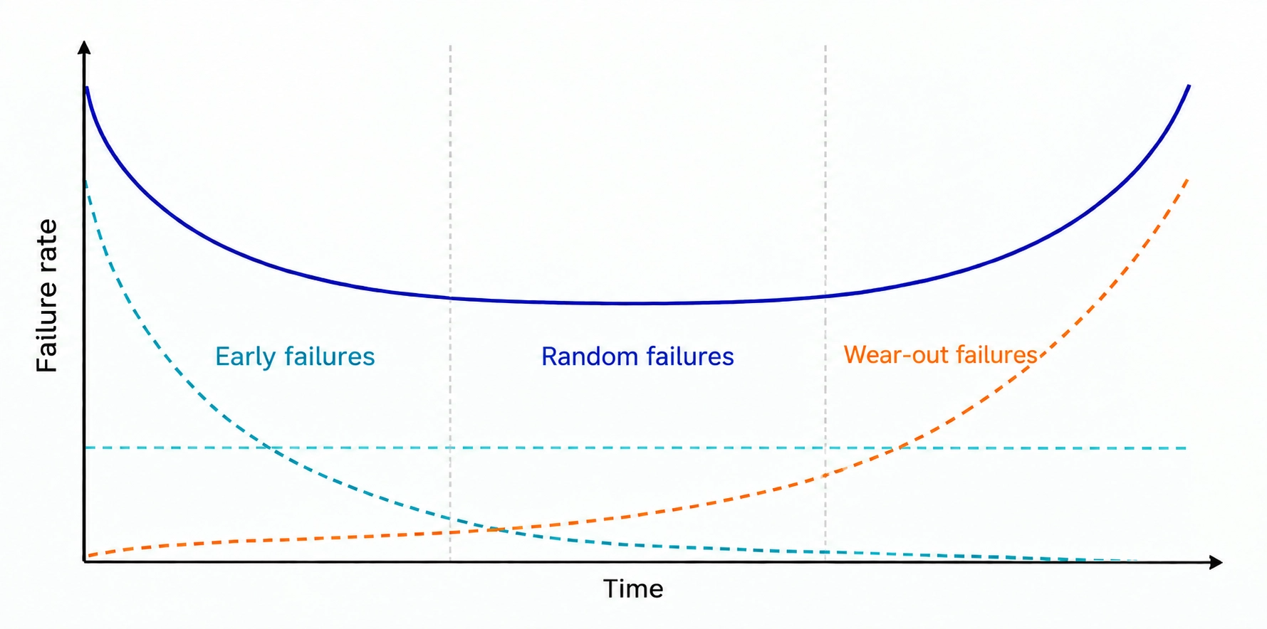
The "Bathtub Curve" in Warranty Chain Management describes this rule, underpinned by the Hazard Function h(t). h(t) does not answer "how many times has this product failed cumulatively," but rather "given that it has survived until time t, what is the instantaneous probability of failure in the next moment"—the former only states what happened; the latter shows which direction the risk is moving.
➤ | Early failure period / h(t) decreasing: mostly design or assembly flaws. | |||
➤ | Random failure period / h(t) near constant: low and steady risk. | |||
➤ | Wear-out failure period / h(t) increasing: material fatigue causes risk to climb again. | |||
Figure 1: Bathtub Curve — Different causes of anomalies at different time points | ||||
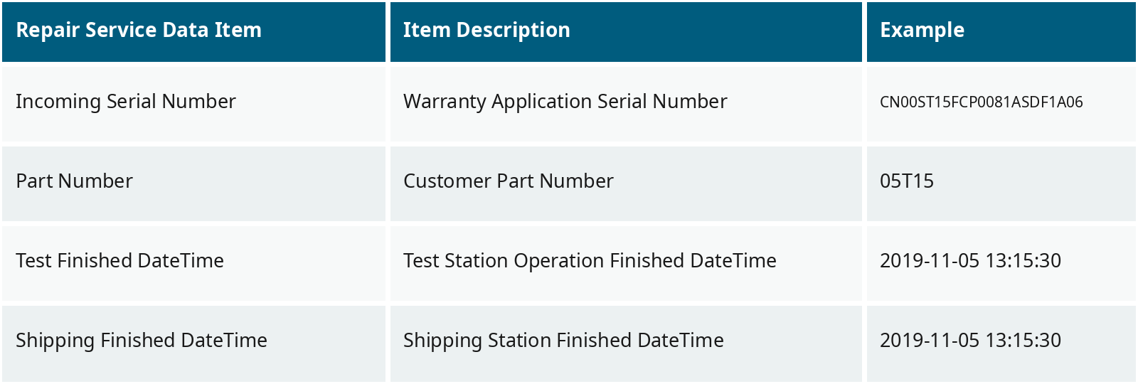
This theory offers a direct reminder for service center management: operational oversight cannot look at a single time-slice figure alone; the same WIP or TAT anomaly means something entirely different depending on where it falls on the bathtub curve — without complete records, it is impossible to judge which stage the failure is at. This is the raw data foundation behind the wareconn Electronic Dashboard: service data, records collected from the application process and repair services during the warranty period, can be obtained directly from the aftersales warranty system. It mainly includes five categories: product warranty data, warranty application data, failure environment data, repair service data, and service cost data. The table below lists field examples for these data types: | ||||
Table 1: Repair Service Data Examples | ||||
II. wareconn Electronic Dashboard: Overview of the Four Key Indicators and Functional Modules
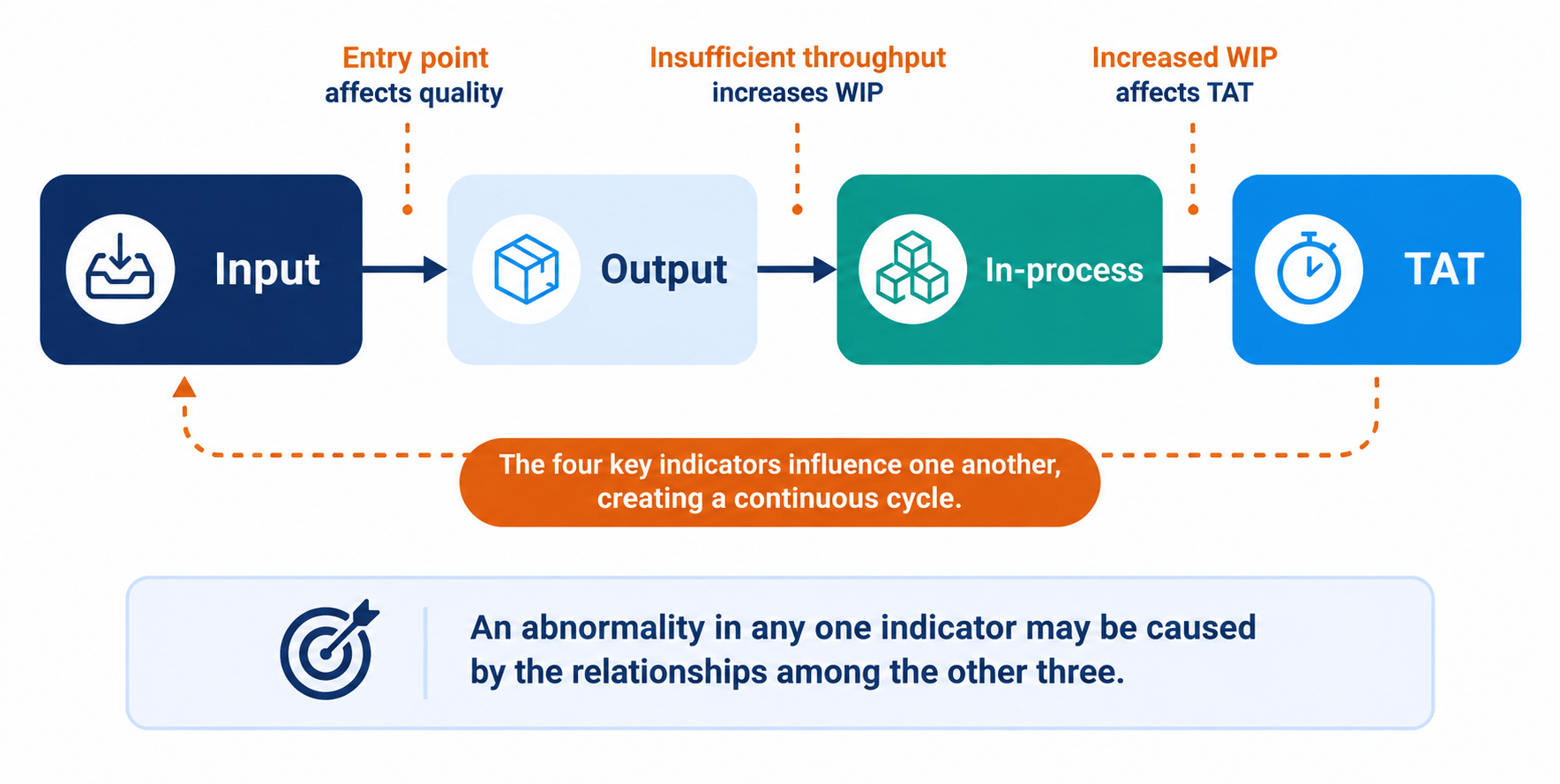
The wareconn Electronic Dashboard centers on four core indicators: inbound, output, WIP, and average TAT. These four indicators are interconnected, not isolated; the dashboard presents them simultaneously on one screen, so managers no longer need to piece together causal relationships from four different reports:
Figure 2: Interconnected Relationship of the Four Key Indicators | ||||
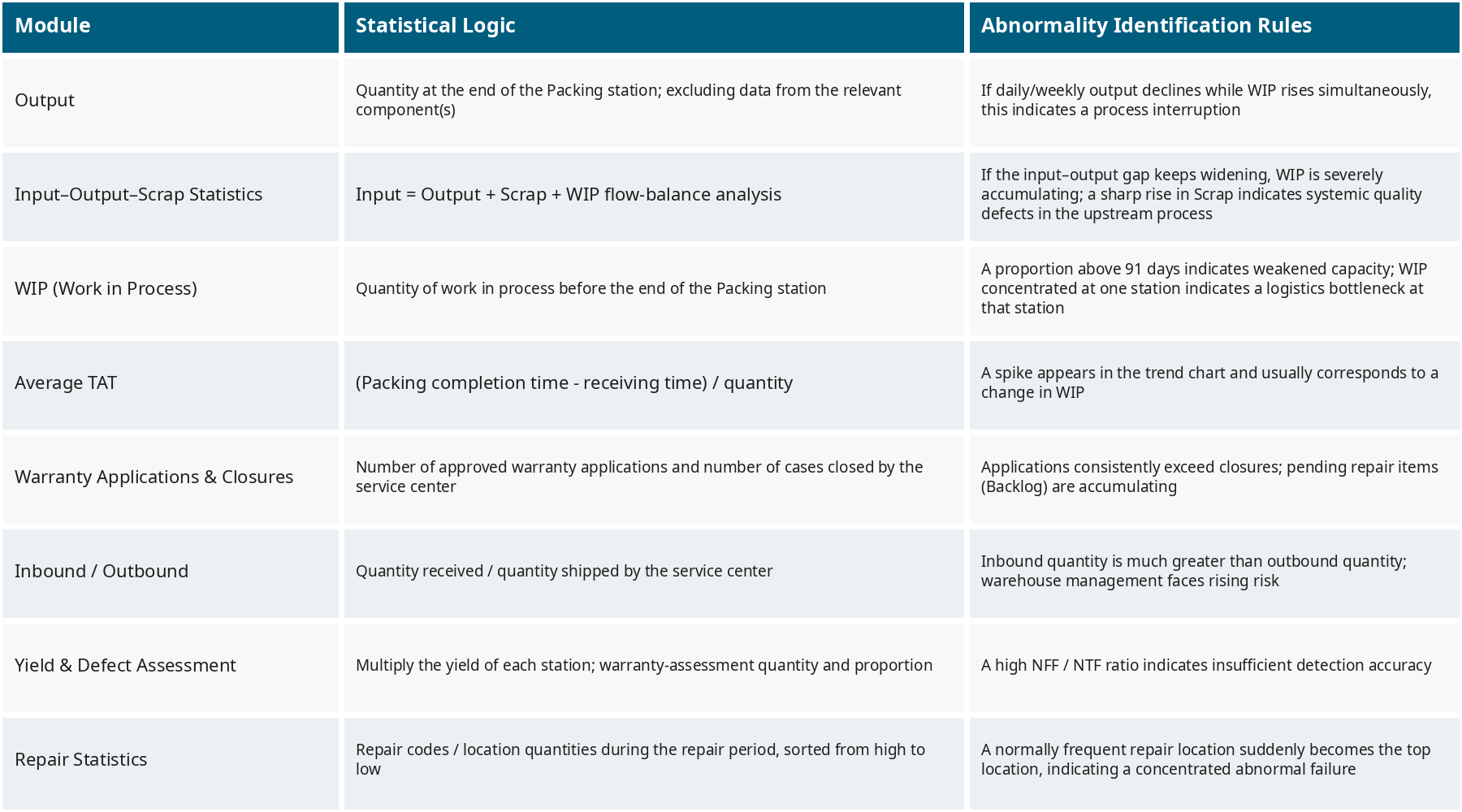
The wareconn Electronic Dashboard decomposes these four indicators into eight visual modules, each with built-in anomaly detection rules, so managers no longer need to flip through reports page by page; the system directly flags signals that deviate from the norm. | ||||
Table 2: Overview of the Eight Modules of the wareconn Electronic Dashboard |
III. Module Deep Dive: WIP Case and Judgment Logic
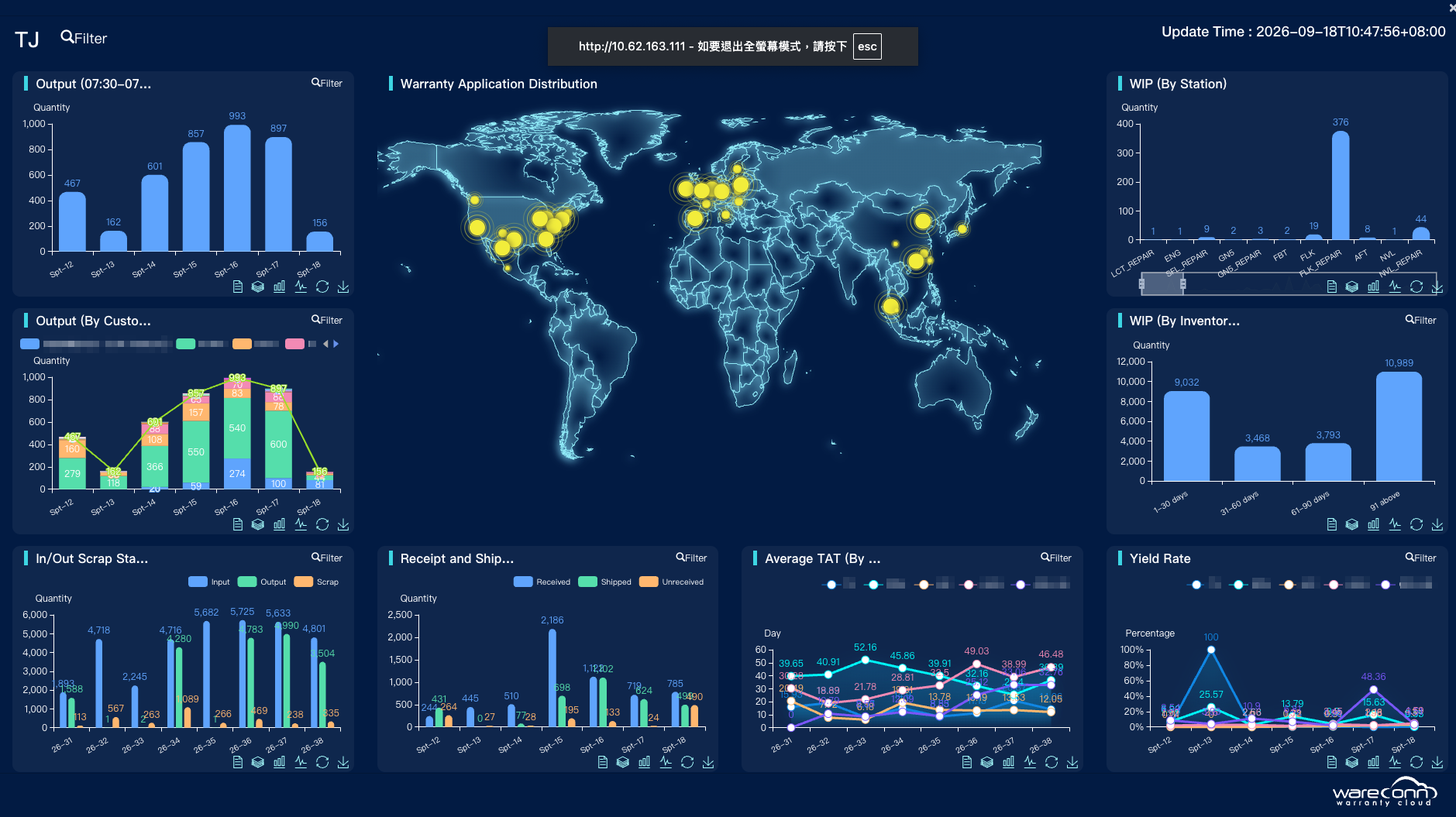
Taking the WIP module as an example, the system not only presents total WIP but also decomposes it along two dimensions: inventory days and workstations. If the proportion over 91 days is noticeably high, it indicates a risk of asset stagnation; if WIP is concentrated at a single workstation, such as Assy test, it means that workstation is a process bottleneck, requiring further investigation into whether it is a parts shortage, a complex issue, or an operational problem like scanning omissions.
Figure 3: Real-world Case of the wareconn Electronic Dashboard | ||||
Figure 3 is a real-world case of the Electronic Dashboard: the top-right "Workstation WIP" decomposes WIP by workstation, and the noticeably high WIP at station VI1 is a classic bottleneck signal; "WIP (By Inventory Days)" decomposes by inventory days, and the group with a high proportion over 91 days is the target for priority investigation into asset stagnation risk. The bottom-left "Inbound/Outbound" module is a real-time presentation of throughput metrics, and a persistent noticeable gap over several weeks is the anomaly signal to capture. | ||||
Among the eight modules, four directly correspond to the four key indicators, while the other four are auxiliary perspectives extended from the core indicators, used to answer why an anomaly occurs, not just that it occurred: | ||||
➤ | Inbound/Outbound Failure Statistics: Throughput trend analysis; a persistently widening gap between inbound and outbound can provide early warning of rapid WIP accumulation; a sudden spike in monthly failure numbers often represents a major systemic flaw in the preceding stage. | |||
➤ | Warranty Application and Case Closure: Gauges repair pressure across service sites; if application volume consistently exceeds closure volume, the backlog of pending cases will explode in the short term. | |||
➤ | Inbound/Outbound: Reflect the overall throughput of the service center; if inbound significantly exceeds outbound for several weeks, it indicates the warehouse will face an overstock risk. | |||
➤ | Repair Statistics: Sort repair codes and locations from largest to smallest; if a location that usually has few failures suddenly rises to first place, it represents a concentrated anomaly failure; cross-referencing the adverse judgment result can also distinguish whether the part itself is flawed or if the root problem remains unresolved due to blind part replacement. | |||
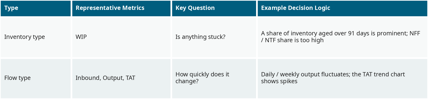
Worth noting is that these eight modules do not apply a single anomaly judgment logic. Inventory-type metrics care about "whether it is stuck," throughput-type metrics care about "how fast it is moving," and the two problems inherently require different statistical logics: | ||||
Table 3: Comparison of Inventory-type and Throughput-type Judgment Logic | ||||
IV. PDCA Cycle and Management by Exception
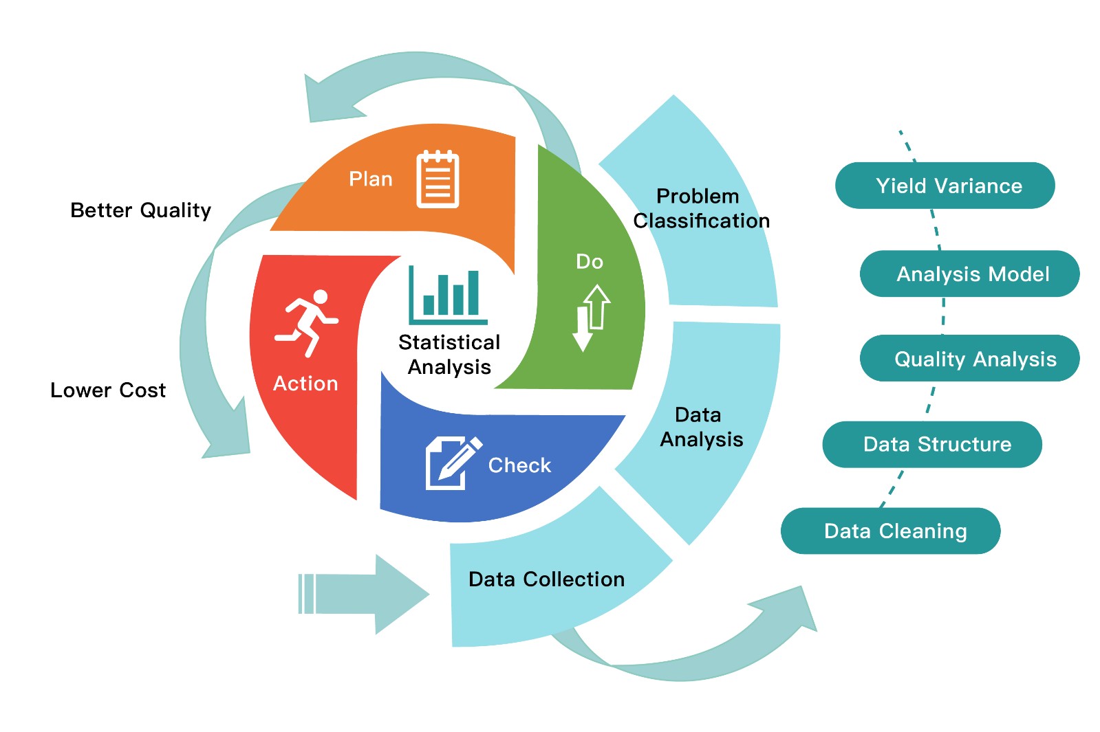
The warranty data analysis workflow can be simplified into the Plan-Do-Check-Act (PDCA) cycle. Under traditional practices, this cycle often runs once a month; the Electronic Dashboard embeds the PDCA cycle into daily monitoring, rather than relying on periodic reports for retrospective review:
Figure 4: PDCA Cycle of Warranty Data Analysis | ||||
Taking WIP stuck at the Assy test workstation as an example, this embedded cycle runs fully: | ||||
➤ | Plan: The system already records inventory days by workstation, so no manual tracking is needed. | |||
➤ | Do: The dashboard automatically compares WIP quantities across workstations, no need to wait for end-of-month aggregation. | |||
➤ | Check: As soon as a workstation quantity is anomalous, the system directly flags that workstation as the primary bottleneck, allowing managers to quickly pin down the problem. | |||
➤ | Act: Further investigate the specific cause — parts shortage, complex issue, or operational errors like scanning omissions. | |||
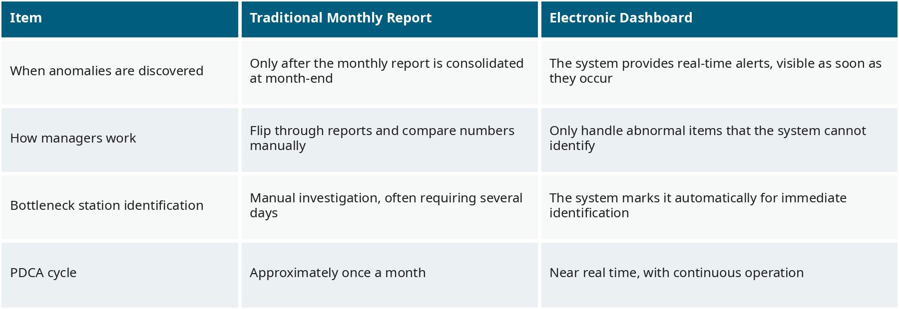
The entire process does not require daily report checks; the dashboard itself is a continuously operating PDCA loop, and the cycle is shortened from monthly to near real-time: | ||||
Table 4: Comparison of Traditional Monthly Reports and the Electronic Dashboard | ||||
This shift in management can be summarized as management by exception: managers no longer need to check every workstation and every indicator for normality, only handle the anomalies flagged by the system. Normal operations are left to automatic system monitoring without manual intervention; attention shifts from carpet-bomb checking to precision strikes, and the management pace moves from monthly to real-time. For service center managers, this means the same manpower can manage more workstations and more customers without sacrificing response speed. | ||||
Conclusion: From Passive Report Checking to Real-time Monitoring
The Electronic Dashboard transforms service centers from passive report checking to real-time monitoring: anomalies are no longer post-facto discoveries in a report but real-time signals flagged as they occur. This aligns with the EU Right to Repair mandate discussed in the previous article — structured, real-time warranty data is the most direct evidence during audits. However, while management by exception lets managers "see anomalies in real-time," it does not answer "whose responsibility is this anomaly and how to solve it at the root." To dig into the root cause, a more systematic analysis workflow is needed, which is the topic of the next article.
If you want to learn more about how the wareconn Electronic Dashboard helps enterprises start from real-time monitoring, visit the wareconn official website (www.wareconn.com) to learn about full features, or contact service@wareconn.com directly; we are happy to explain how to implement it.
Author
Wareconn Editorial Department

Warranty Data-Driven After-Sales Upgrade: Data Statistics.pdf
Reference
- Albert Liao, (2022),Warranty Chain Management - Digitalization and Sustainability, Springer.